Do you ever imagine some lovely project and how marvel at how wonderful it will look once finished only to come unstuck half way through because what you had originally envisioned just wasn’t working out?
And so it is with my Liberty print hexie paper piecing wall hanging project. Purely for decorative purposes, this is intended to hang above my sewing machine on the wall in my little corner of the study. I will hang it there because it is MY space and Mr Jones cannot object to what I hang in MY space.
I’ve collected my liberty hexies into some sort of colour theme and sewn the flowers together.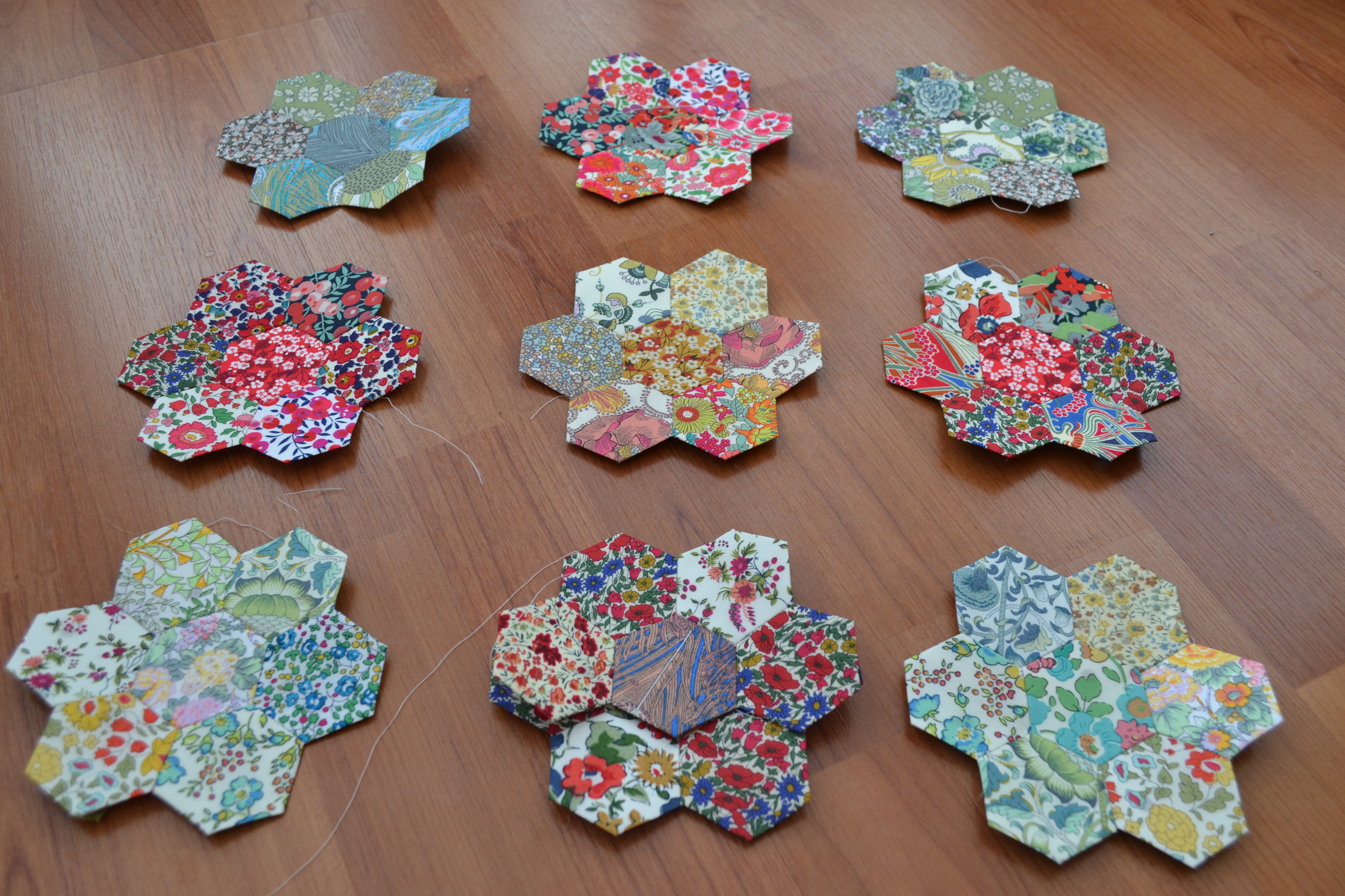
Then I’ve made another 50 hexies in some liberty blue ditzy print stash fabric thinking that the use of this print throughout would ‘bring it all together’.
It didn’t.
Just a mess of prints.


Plan B is to make a load of grey/blue hexies to calm the whole thing down. But I wonder whether in doing so, I’m diluting the liberty hexies too much.


What do you think? Which way shall I go? Shall I stick with Plan A; the madness of the full en masse of prints or shall go with Plan B; the calming grey/blue route?
Love, Lucie x

Love plan B. Plan A a little confusing, but it will be above your sewing machine, so final choice …over to you!
LikeLike
General consensus is a plain background, like you say. But others have now suggested a lighter one so back to the drawing board!
LikeLike
the one with the solid background. it lets the lovely fabric shine!
LikeLike
I agree but I think I’m going to investigation a different, paler colour
LikeLike
Plan b looks lovely x
LikeLike
I’m going to go with plan B but I might just look at a paler colour.
LikeLike
I like plan B. But I am one who enjoys symmetry in a projecy
LikeLike
Yes, me too! But i’m going to look at some other colours first.
LikeLiked by 1 person
Plan B is more visually appealing and easier on the eye. The grey won’t dilute the Liberty prints but quite the contrary, they will stand out more and the grey will provide a subtle backdrop.
LikeLike
Thanks for our comment. I though Plan B too but I think I might just look into some other colours first.
LikeLiked by 1 person
I prefer ‘B’ but the plain fabric is a big contrast. Have you thought about a ‘tone on tone’ blender fabric in ivory or even grey where the fabric has a bit more depth and interest to it, albeit in one colour. It might provide a more subtle contrast. Just a thought.
LikeLiked by 2 people
Trust you to be absolutely right. I’m going to look into some other background colours as I’m not truly happy with the grey. I’m trying to work from my stash but I can see a trip to town beckoning.
LikeLike
I agree plan B is best, but I also think that the blue does tend to dumb down the lovely colour prints in the flowers, I think cream would be ideal – or a soft green? but definitely a neutral lighter colour to show off those lovely prints. I do love hexies, they are so neat and easy to carry around, but take forever don’t they?
LikeLike
I think you are right. I’m going to look at some other colours. I’ve been using a glue pen to baste the hexies so it is not taking as long as it could do. I’m trying not to be too impatient and ENJOYING THE PROCESS!
LikeLike
I prefer ‘B’ also…allowing the grey to show gives the eyes a place to rest. :0) mari
LikeLike
I agree with you but I’m wondering if the contrast is just too much. I’m going to look at some alternative colours.
LikeLike
This is what I don’t like about this kind of thing! Could you not use white or cream hexies as a background instead of the grey? A bit boring perhaps but it would make the patterns pop out more?
LikeLike
You are not the first to say this! I’m bowing to popular opinion and going to seek out some alternative colours.
LikeLiked by 1 person
Ah, this happens to me a lot. I call it a “visualisation fail”. If I don’t correct the thing that is niggling me then I won’t enjoy finishing the project, which is a shame. I agree with tialys’s comment but you should go with what you prefer – especially if it’s for your creative space, you want to be inspired by it!
LikeLike
I too have learnt that it is better to step back and re think. It’s like frogging/undoing your knitting. Painful but you know you won’t be happy if you can see that dropped stitch.
Thanks for your comment. I’m going to investigate a paler contrast.
LikeLike
I hope you love it in the end! 🙂
LikeLike
I like plan B. The blue/grey background really shows off the patterned hexagons and I love the calm symmetry of the thing.
LikeLike
Plan B seems the winner but I’m going to investigate a few other colours first as suggested by a few others. Thanks for dropping down your opinion.
LikeLike
Plan B will highlight the hexie flowers in a subtle way, a lighter background will emphasise them even more, depends on the look you want for your little corner 🙂
LikeLike
I think I’m being pulled towards a lighter plain background. Will report back.
LikeLike
I kinda like plan A, but I can be weird like that. For plan B, I would go with a tone in some fabric, but in a clearer version of blue or green. The grayer blue is dulling the prints, in my opinion. And take this next one with a grain of salt, because I love bold contrast and eye popping colors. I think a charcoal or black tone on tone would just make the prints shine. But all your options are lovely, so go with what you like.
LikeLike
I have been really interested to hear everyone’s opinions. I think that the reason I wasn’t in love with Plan B was exactly that it seems to be dulling the prints. I’m going to investigate a different background. The charcoal background sounds really interesting and if my little room was blessed with light I would definitely consider it. I am going to look into something paler. For once I’m not going to rush into this!
LikeLiked by 1 person
I much prefer plan B . Think thus will make excellent wall hanging .x
LikeLike
Yes, Plan B it is. However I might consider some other colours before I commit. I’ve had so many comments regarding this. It’s been lovely. x
LikeLike
Yes I agree I bought a half finished hex quilt from a charity shop sometime ago.it has lighter colours in it as plains preferable cream or white
LikeLike
I’m going to put a vote in fir plan B as well. Can’t wait to see what you come up with.
LikeLike
Gosh a resounding yes for plan B – me too. Really looking forward to the finished piece – it’ll be a project to cherish no matter what you decide x
LikeLike
Hiw about plan b but with another liberty print in say pale greys. A small print or small polka dot perhaps?
LikeLike
I like plan b myself.
LikeLike
I like plan A but then, I would! As for plan B, I think you could consider a more vibrant plain colour, a clear light orange or a cerise, or turquoise, something that will make the other prints sing , not dull them.
LikeLike
Gawd! So many good ideas. I really don’t know which way to turn!
LikeLiked by 1 person
I know I am too late but I am playing along with the game. Plan b. Now off to see what you decided. 😉
LikeLike
Sorry if this a bit late but…….Firstly the hexies look so pretty, lovely colours. How about considering something a little inbetween, if you laid them out as in Plan A but moved the hexies just a little apart then put in all onto a lighter background.
LikeLike