
So, for all those that were kind enough to give me your opinion yesterday (and there were many of you!) I now have Plan C, D, E and F.
The general consensus yesterday was to go with the plain background.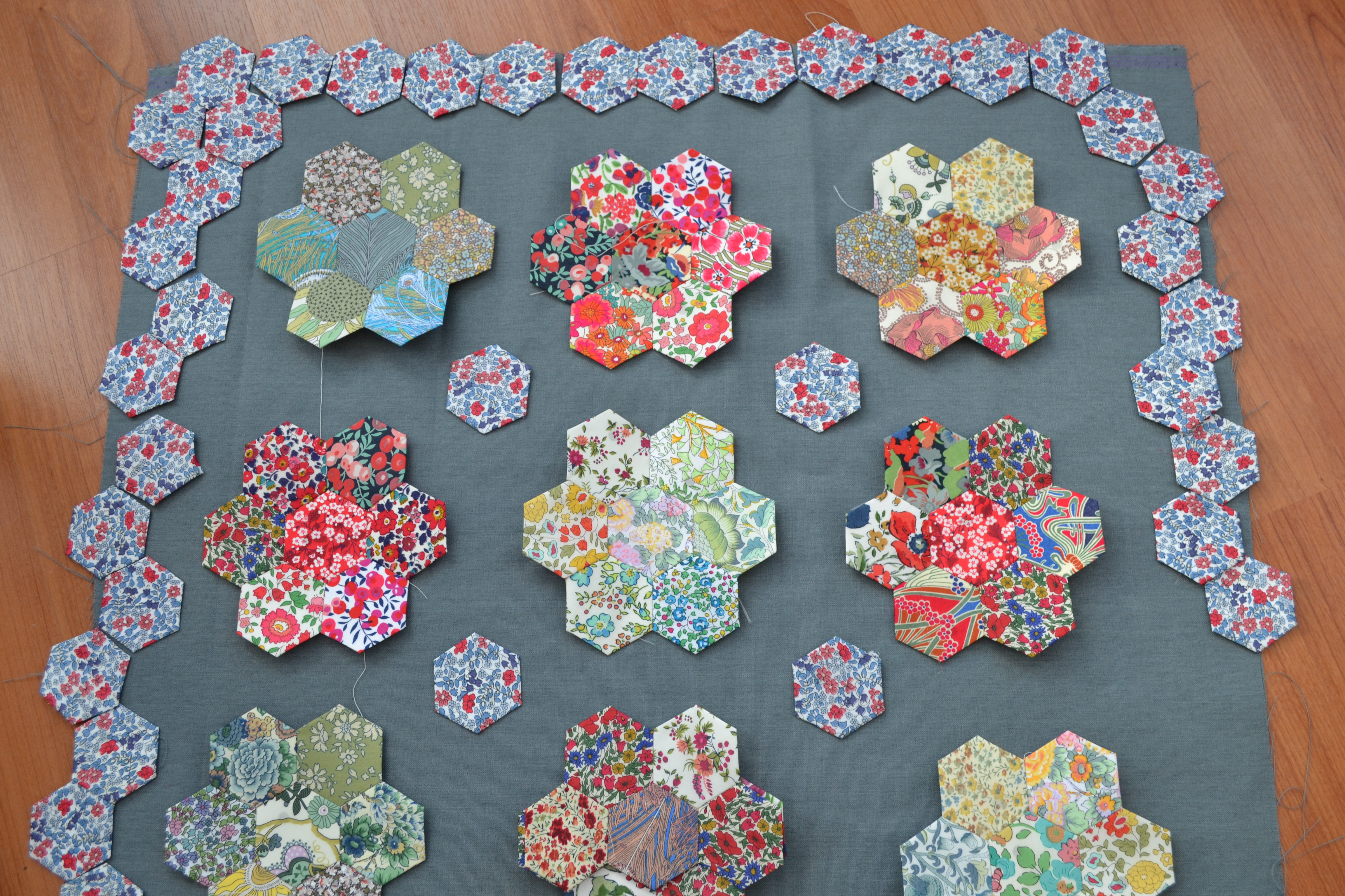
Then I agreed with those of you that suggested to go with the plain background but maybe consider a more neutral colour in order to make the prints sing out.
In this too, I was in agreement.
But then PollieMath posed an alternative by suggesting a small Liberty print as a background but this time in something pale, maybe grey.
I was hoping to use fabric from my stash but I think PollieMath may have a point.
Using a small pale Liberty print might just result in the kind of look I was aiming for originally. Slightly mad but very pretty and recognizably Liberty.
The only problem is that it’ll cost me £22 for the metre unless I can find half a meter from another outlet. A positive is that I’ll be using the same type of fabric across the whole piece which has got to be a good thing.
So, over to you. Your votes please for
Plan B – Grey/blue background from my stash
Plan C – Zingy sour yellow again from my stash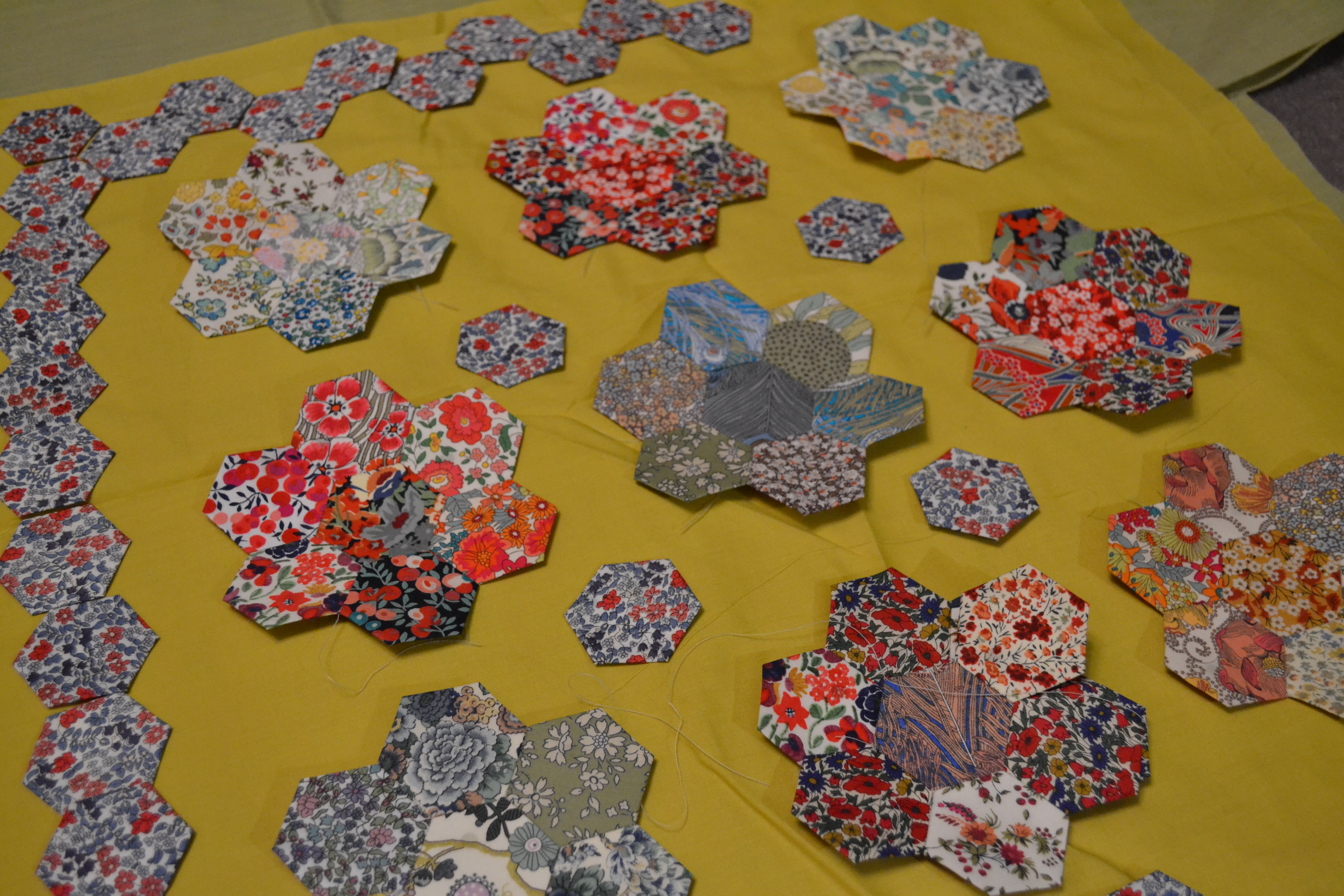
Plan D – Lime green from stash – colour not entirely true; shot at night.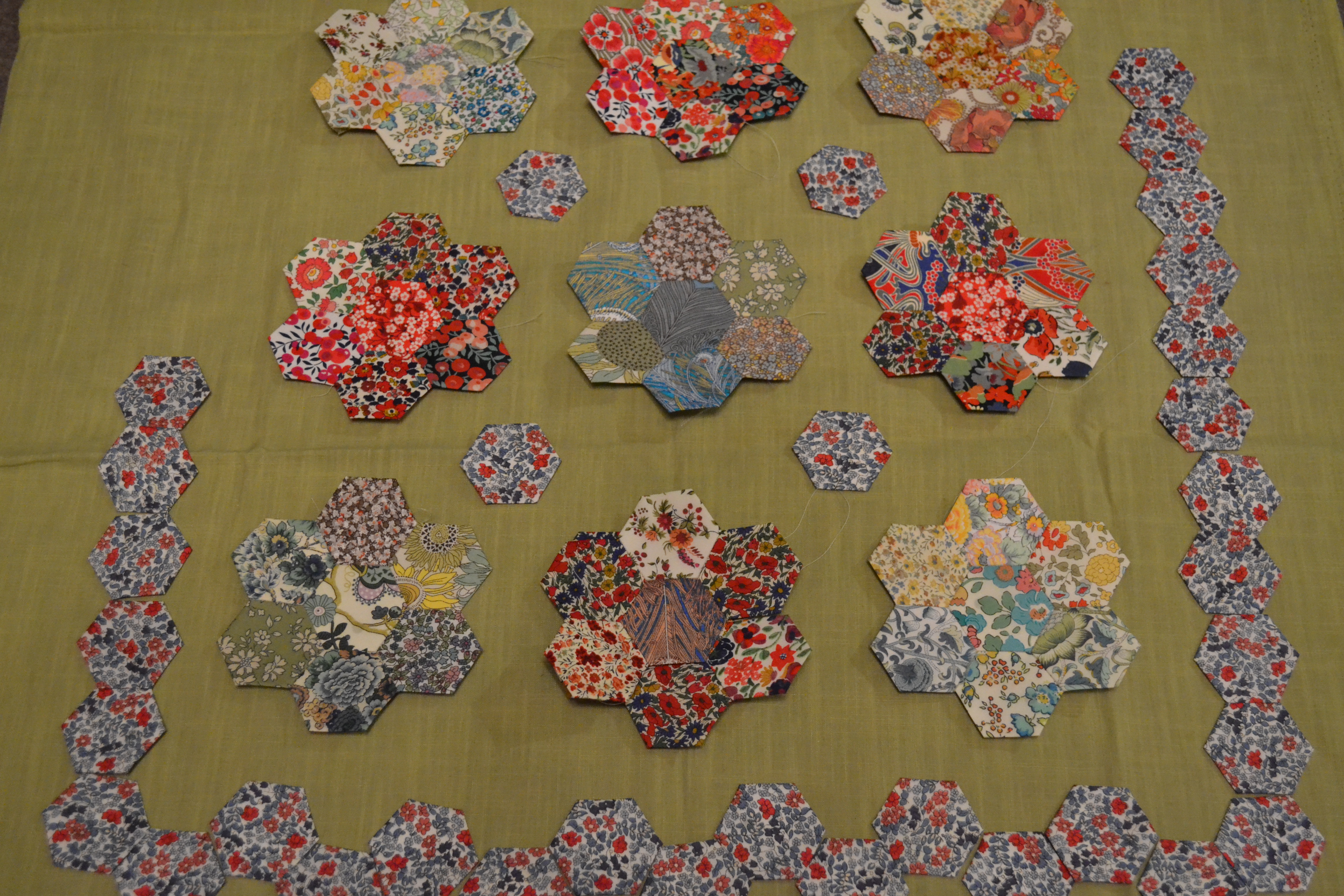
Plan E – Yellow Laura Liberty Print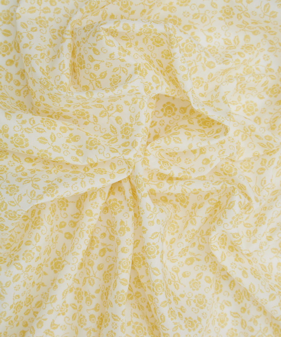
Plan F – Yellow Michael Liberty Print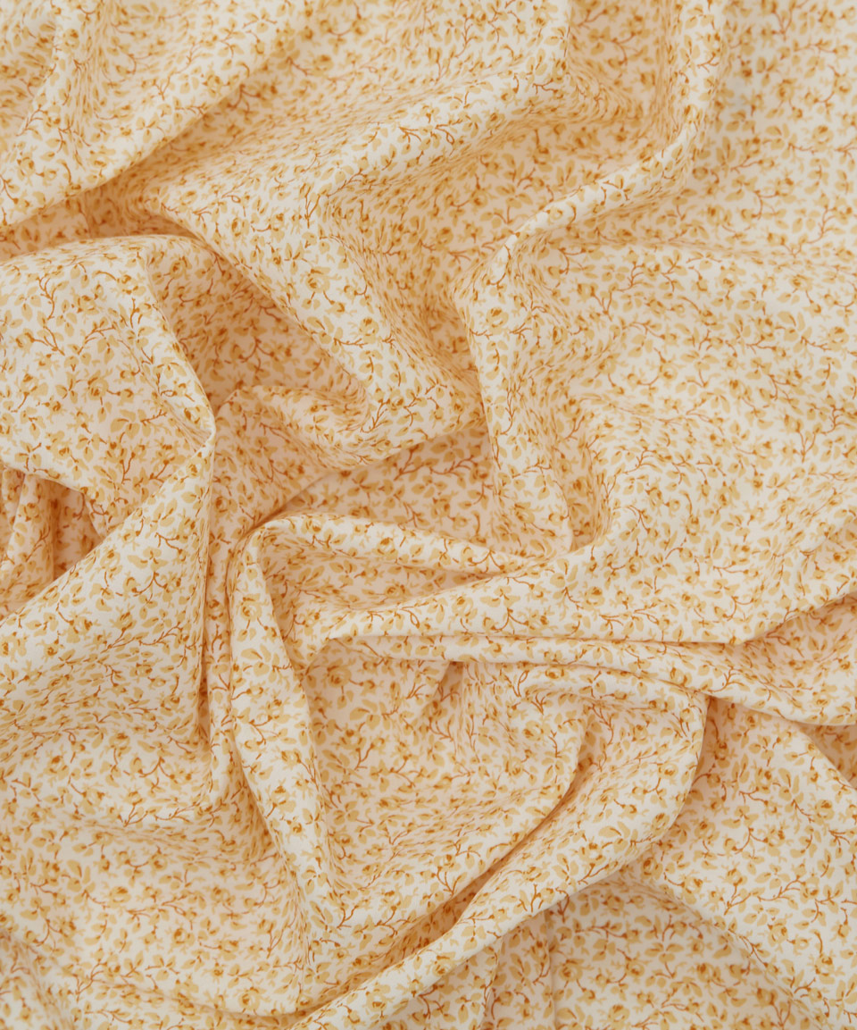 I await your honest opinions. Here are the hexies by themselves.
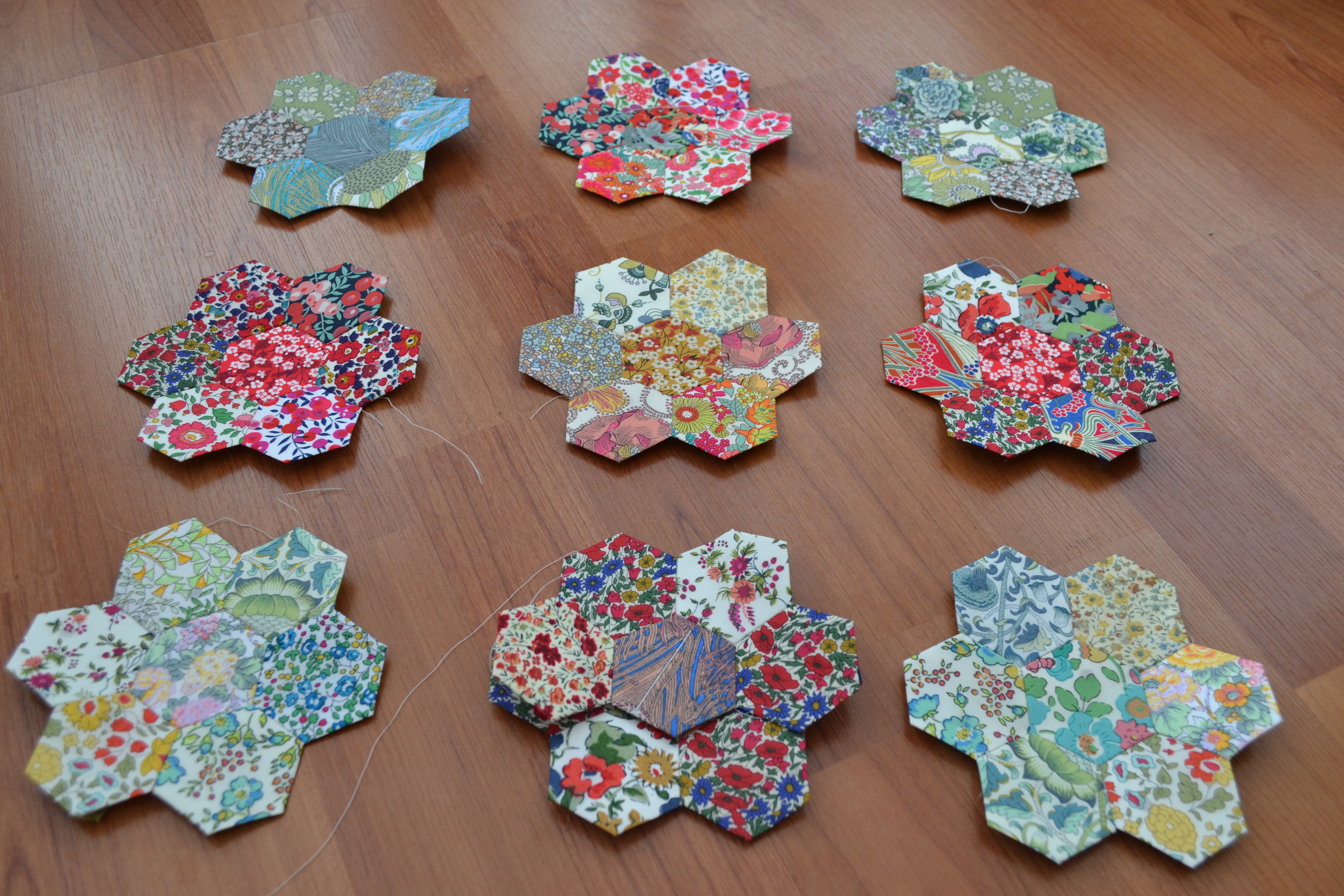
Plan G anyone?
Love, Lucie xx

Oh my goodness, this is all so beautiful yet so confusing. Sorry, nothing helpful to say here! (though I do like that yellow Liberty print…)
LikeLike
I’ve really no idea now!
LikeLike
I’m still lovin’ the grey…….
LikeLiked by 1 person
I was actually thinking of a slightly more creamy colour but with a tiny pattern on it in the same colour, if you know what I mean. It’s called tone on tone or blender fabric – it’s a really useful fabric to have in patchwork generally. I can’t find a good enough photo of it to give you a link because it is quite subtle and doesn’t show up well on screen. I think the grey, zingy yellow and green are too ‘flat’ but that’s just my opinion and, let’s face it, it’s going to look fab whatever you do as you are using lovely Liberty. I like the first Liberty fabric you show and you can get half a yard at a bargain price here http://www.ebay.co.uk/itm/NEW-FOR-2015-Liberty-Lawn-Laura-in-Yellow-Alice-in-Wonderland-33cm-50cm-/161559108233?pt=UK_Crafts_Fabric&hash=item259dac5a89 – sorry for the long link.
LikeLike
Forget that link! She’s selling 50cm but it’s only by 33cm. Thought it was too good to be true.
LikeLike
Plan B, grey background! The other fabrics are lovely but too fussy to show the lovely Liberty print. If you have yellows you can try a Dresden plate design in yellow to creat a sunflower wall hanging…………
LikeLike
I’m edging back towards the grey too!
LikeLike
Aha! Good old Cotton Patch have got some of what they call ‘Essential Lights’ http://www.cottonpatch.co.uk/acatalog/Essential_Light_fabrics.html. You might not want to use something like that but I was determined to show you what I meant!!
Must go and do some housework……….
LikeLike
Right. I can see what you mean. I never knew such things existed. Definitely another one to consider. I’ve had a bit of a search of other liberty hexie quilts. This seems a popular option that really makes the prints pop. Thanks.
LikeLike
I like the grey because the print really shines out.
LikeLike
I think the grey makes for the cleanest look.
LikeLike
I agree.x
LikeLike
For me it would be a definite no no to C and D – I like E best, F ok. It’s great that so many people are keen to help you with your dilemmas! Good luck x
LikeLike
I’m glad to know such an opinionated group!
LikeLike
I still like b. I could be convinced to for g if you find a tonal blue/gray print. I think it makes the colors you have sing.
LikeLike
B seems to be winning!
LikeLike
Plan B for me. I think the colours of the flowers show up best on that background out of all of them 😊
LikeLike
Plan B seems to have a clear lead!
LikeLike
Plan B for me but I was wondering – are you thinking of making the plain blue-grey into hexies or sewing the Liberty hexies directly onto the plain background? I think adding shape and texture into the blue-grey might help pull the whole thing together. Just a thought – I am not an expert!
LikeLike
I’m making the grey up with hexies. I agree it needs some texture.
LikeLike
I like the sour yellow! Sorry I’m not being helpful, but I am not overfond of grey 😉
LikeLike
There always one, and you are usually it 😉
LikeLiked by 1 person
Oh it’s so hard but I think I actually rather like the bluey grey Plan B now!
LikeLike
Ha! Me too!
LikeLike
I’ve seen similar projects with the floral hexagons surrounded plain white hexies and I think they look beautiful but that’s just my personal taste!
LikeLike
I think if I was going for a larger quilt, I would definitely go down that route. I’ve seen some similar too. But as this is a small hanging I’m going to go with some colour.
LikeLike
I vote Plan C as I love the zinginess, really makes the hexies pop. Or I like the idea of the a blender fabric. Can’t wait to see which way you go!
LikeLike
The zingy sour yellow looks even better in the light. I’m really torn now.
LikeLike
I like the bright yellow or the yellow print. I painted my dining room bright yellow and it really makes all my wall art pop. A tone on tone yellow would be pretty.
LikeLike
You are the third vote for the yellow. It’s coming in second after the grey which is leaps ahead in popularity. I think the yellow might just add a shot of something to the piece. I’m going to make up some yellow hexies to get a better idea.
LikeLiked by 1 person
Go for it!
LikeLike
Plan D, Lime Green! All are lovely though.
LikeLike
I mean C!!! The zingy one!!
LikeLike
Square off the hexies then add a a plain strong border to each then join together. Cath Kidston have some fabulous quilts, go and look at those for inspiration! Call it plan X!
LikeLike
I still like the blue grey as it is similar to colours already in your hexagon groups.
LikeLike
Plan C the sour yellow get’s my vote, it really brings the colours out of the hexies!
LikeLike